oct. 2017
Escape the ‘zombie styleguides’: 3 methods to arm yourself and defeat them
In early october (2017), I had the opportunity to speak at Paris Web about design systems and some experiments we made at Startup Palace to try to improve the adoption of this methodology.
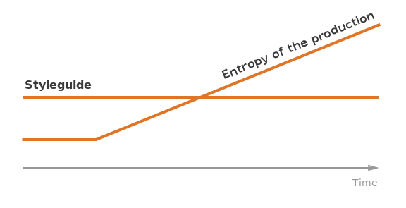
The starting point was a mistake we made when first setting up our styleguides in previous projects. Styleguides were indeed used to face the entropy of the production (i.e. its unpredictabiliti: moving constraints, technical issues, specs variations, …) by promoting scalability, reusability and a modular workflow.
But we mostly only used the styleguide for front-end purposes (testing, documenting components, …) and even stopped using it when the first UI were done. Designers, back-end developers and even product owners were thus put aside from the method…
The consequence is that, once used by the front-end dev, the styleguide was abandoned and became what Jina Anne from Salesforce called a ”zombie styleguide”, an half-living half-dead methodology. The “transformation” happens when the styleguide cannot control anymore the entropy of the production.

The issue we had to face was clearly to respond to the lack of adoption of the methodology, and rebuild our process so everyone in the team could benefit from it.
We then experimented 3 methods that I introduce in the talk:
- The Value Proposition Canvas, from Alex Osterwalder’s book “Value Proposition Design”, a workshop that allows us to involve the whole team to define its needs and define a proper strategy at the root of the design system.
- The Interface inventory, a workshop to kickoff our styleguide by engaging the whole team around the definitions of the system patterns and the “shared vocabulary”.
- The design tokens are a more experimental tool I wrote about in a previous article that aims, among other benefits, to empower non-developers to engage with code so everyone in the team can contribute to the design system.
The common theme of these methods is to involve and align the whole team in the definition, conception and building of the design system, so everyone can make hers/his the methodology and prevent the constantly growing entropy of the production…
…and hopefully escape the zombie styleguide.
Here are the slides I made to support my talk. You can also read them directly at thibault.mahe.io/talks/escape-zombie-styleguides/.
You can also read the script I made from the talk (in French).
Special thanks and credits
- The photos are awesome and were found on Flickr. All the credits are in the last slide of the presentation.
- The first time I considered the design system as a response to the entropy of the production, as I defined it in the talk, was in an article from UXPin CEO Marcin Treder, in an article called “The Minimum Viable Design System”.
- There isn’t one standard definition of what a “design system” is, but probably as many as there are people using the method. That being said, the definition I used in the talk is very close to the one given by Alla Kholmatova in her awesome book Design Systems.
- The term “zombie styleguide” was coined by Jina Anne.
- The example I gave to present different strategies from different famous design systems is inspired by an example that Nathan Curtis often gives in his workshops and talks, for instance in this presentation Beyond the toolkit
- The Lego and chemistry metaphors are illustrated by screenshots from Brad Frost’s book Atomic Design.
- As I said in the presentation, the industrial process metaphor was given by Mail Chimp’s UX designer Federico Holgado in a talk he gave in 2014 in Nantes. A good summary can be found in the article Issue 17 // Systemic Design.
- The music metaphor was coined by Audrey Hack and Florian Cordier from the french design and web agency Backelite. I first heard it in Audrey’s awesome talk at the UX Days 2017, and you can find more about it in the article “Atomic Design & creativity”.
- The language metaphor is more common and widely used in various design systems. But I found that Marcin Treder was the one who presented it in the best way in his article “Design Systems Are a Language. Product Is a Conversation”.
- The design tokens become more and more of a thing. For instance, the recent Photon Design system of Firefox features them. They first have been experimented by the Salesforce’s UX team in their Lightning design system. The team even created a specific, open sourced tool for transforming and formatting the tokens, named Theo. The experimentation we are currently doing is highly influenced by their work and by Nathan Curtis’ article “Tokens in Design Systems”.
- The talk from Simon Sinek I introduced in the conclusion of my talk was made in September 2009 at TEDxPuget Sound and is available on the TED website.
- The slides are made with the open-sourced markdown-driven slideshow tool remarkjs.
I am not a professional speaker, so it was really a great, unique and stressful experience for me. I would like to thank all the people I mentioned above for their work and ideas that gave me the motivation to work on design systems and suggest this talk. And I specially thank Paris Web for their warm welcome, their organisation and for doing me the honor of having me among really great speakers.